Multi-Layer Stencils: Planning Your Colours for Impact
You’ve spent hours cutting a three-layer stencil, the bridges are clean, the registration is tight, and then you pull the final layer and the whole thing turns to mud. We’ve all been there. One bad colour decision — a mid-tone that swallows your highlights, a background that fights your focal point — can flatten a technically perfect piece into something forgettable. In multi-layer stencil art, colour isn’t decoration. It’s structure. Get the planning right before you cut a single sheet, and everything downstream gets easier.
Why Colour Planning Matters in Stencil Art
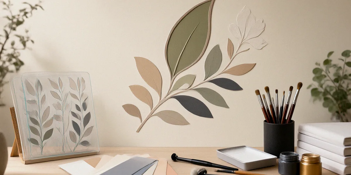
Stencil work is a subtractive, layered medium. Unlike a painter who can glaze, blend, and correct on the fly, we commit a colour every time we lay down a layer. Each pass of spray paint either adds depth or destroys it. Colour choices determine how the eye reads form, where contrast pulls attention, and what emotional temperature the finished piece carries. A stencil about isolation and a stencil about celebration might use identical linework — the palette is what separates them.
If you want a benchmark for how seriously colour planning pays off, look at the Australian Stencil Art Prize. The finalist wall is a masterclass in restraint and intent. Winning entries rarely win because of the most layers or the most colours; they win because every colour earns its place. Treating your palette as a design decision, not an afterthought, is the fastest way to move your work toward that standard.
The Role of Contrast in Layered Stencils
Contrast is what makes a stencil legible. Without it, layers collapse into each other and the image reads as a flat silhouette. The most reliable contrast in stencil work is value contrast — light against dark — rather than hue contrast. A red shape on a green background can still disappear if both sit at the same value. Before you think about colour at all, squint at your design and check whether the layers separate in greyscale. If they don’t, no palette will save them.
Common Colour Mistakes to Avoid
We see the same handful of problems over and over in beginner multi-layer work:
- Too many mid-tones. Five layers of similar value produce a grey, lifeless result. Push your darks darker and your lights lighter.
- Using pure black for shadows. Black kills transparency and depth. A deep umber, indigo, or burgundy usually reads better.
- Ignoring the base surface. Spray paint is often semi-transparent, so your wall, canvas, or paper colour is effectively your first layer.
- Choosing colours layer by layer instead of planning the whole stack upfront. This is how you end up with a fourth layer that has nowhere to go.
Understanding Colour Theory for Spray Paint
Spray paint behaves differently from tube paint. It’s fast-drying, semi-transparent at low opacity, and its colour range is dictated by what brands actually produce. Montana spray paint and Ironlak spray paint both offer large, well-organised ranges, and both publish colour charts with value and saturation information — use them. Knowing the basics of colour theory lets you pick from those charts with purpose rather than vibes.
Complementary and Analogous Schemes
Complementary colours sit opposite each other on the colour wheel — orange and blue, red and green, yellow and violet. They create maximum vibration and are excellent for focal points, but use them sparingly in a stencil. A full complementary palette across five layers will feel chaotic. Analogous schemes, which use colours sitting next to each other on the wheel, produce cohesion and mood. A blue-green-teal stack reads calm and atmospheric; a red-orange-yellow stack reads hot and urgent. Most strong stencil pieces use an analogous base with one complementary accent.
Value and Saturation in Layers
Value is how light or dark a colour is. Saturation is how pure or greyed-out it is. In stencil work, value does the heavy lifting for form and saturation does the work for mood. Desaturated colours recede and feel documentary or melancholic; highly saturated colours advance and feel graphic or pop. A useful rule: keep your value steps even across layers, and vary saturation deliberately rather than randomly.
Planning Your Layers: From Light to Dark
The standard approach in multi-layer stencil art is to work from light to dark. Light colours are typically more transparent and cover less, so laying them first means darker layers can build over them cleanly. Working dark-to-light forces you to over-spray light colours to cover dark ones, which usually means thicker coats, softer edges, and lost detail.
Australian artists have built careers on disciplined layering. Ha-Ha, the Melbourne stencil artist known for intricate, multi-layered portraits and social commentary, treats each layer as a value step, building up from pale base tones into dense darks. Rone, the Melbourne street artist famous for his large-scale portraits of women, uses a muted, almost faded palette where the layering order creates that ghosted, weathered quality his work is known for. Neither artist improvises the stack.
Ordering Layers for Optimal Coverage
A practical ordering method for a five-layer stencil:
- Layer 1: the lightest value, often a base tone close to your surface colour.
- Layer 2: a light mid-tone, still well above your darkest value.
- Layer 3: the true mid-tone — this is the layer most likely to cause problems, so test it.
- Layer 4: a dark tone, but not black. Think deep blue, brown, or green.
- Layer 5: your darkest accent, used only where you want the eye to land.
If a layer feels redundant, cut it. Fewer, better-spaced values almost always beat more layers.
Testing on Practice Surfaces
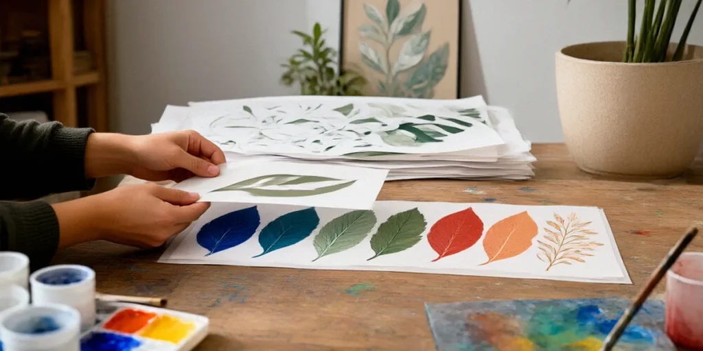
Never test a new palette directly on your final piece. Grab offcuts of the same surface — canvas, MDF, cardboard, or paper — and run a small version of the full stack. This reveals how transparent your colours actually are, how they interact where they overlap, and whether your mid-tone is doing its job. It takes twenty minutes and saves pieces.
Choosing a Colour Palette for Your Stencil
A palette is a decision about meaning. Before choosing colours, ask what the piece is about. Grief, protest, nostalgia, celebration, and satire all suggest different temperature ranges and saturation levels. Once you know the mood, choose a palette that supports it rather than one that merely looks good on a colour chart.
Past Australian Stencil Art Prize winners are a great reference point here. Winning works tend to use tight, deliberate palettes — often three to five colours — with one accent colour reserved for the most important part of the image. Studying finalist catalogues is one of the cheapest forms of art education available to Australian stencil artists.
Limited Palettes vs. Full Spectrum
Limited palettes — two to four colours — force clarity. They’re ideal for high-contrast graphic work and for pieces where the message matters more than realism. Full-spectrum palettes allow for photographic depth and subtle skin tones, but they demand much more testing and a steady hand with layer order. If you’re newer to multi-layer work, start limited and expand once your value control is solid.
Incorporating Metallics and Fluorescents
Metallics and fluorescents are accent tools, not base colours. A chrome or gold layer placed near the end of the stack catches light and draws the eye immediately. Fluorescents, especially in Montana and Ironlak ranges, are highly transparent and behave unpredictably over dark layers, so test them on offcuts first. Used sparingly, they add a jolt of energy that flat colour can’t match.
Tools and Techniques for Precise Colour Application
Clean colour application comes down to three things: the right paint, the right cap, and consistent technique. Australian artists have good access to supplies through Art Spectrum and independent local art stores, many of which stock Montana, Ironlak, and specialist stencil materials. Building a relationship with a local store pays off when you need a specific cap or a colour that’s hard to find online.
Choosing the Right Spray Paint
Low-pressure cans give you more control and finer edges, which matters enormously in multi-layer work. High-pressure cans cover fast but overspray badly. Montana spray paint is available in several pressure ranges, and Ironlak spray paint offers a solid balance of coverage and control at a friendly price. For fine detail, a low-pressure can with a thin cap beats a high-pressure can every time.
Using Adhesives and Registration Marks
Registration marks are non-negotiable in multi-layer stencils. Mark consistent alignment points on your surface and on every stencil sheet before you start spraying. Reusable adhesive spray keeps thin stencil edges flat against the surface, which prevents underspray and gives you crisp lines. Light coats, sprayed from a consistent distance, with the can kept moving, will always beat one heavy pass.
Case Studies: Colour in Award-Winning Stencil Art
Looking closely at Australian Stencil Art Prize finalists, a few patterns stand out. Many winning pieces use a warm-cool split: warm tones in the subject, cool tones in the background, or the reverse. This creates depth without needing extra layers. Others use a near-monochrome palette with a single saturated accent — a red, a cyan, an orange — placed exactly where the artist wants your eye to go.
Rone’s large-scale work is a good study in restraint: muted ochres, dusty pinks, and pale blues layered to create a faded, cinematic atmosphere rather than a realistic one. Ha-Ha’s stencils often push contrast harder, using dark, dense layers to carve out facial features and text. Both approaches work because the palette is committed to a single idea.
Lessons from Winning Entries
- Commit to a mood and let the palette serve it, rather than chasing realism.
- Reserve your most saturated or brightest colour for one focal area.
- Keep value steps even; don’t cluster layers in the mid-range.
- Test the full stack before committing to the final surface.
Applying Their Techniques to Your Work
Pick one winning piece you admire and reverse-engineer its palette. Identify the lightest value, the darkest value, and the accent. Then rebuild a small test stencil using those same value relationships with your own colours. This exercise builds palette intuition faster than almost anything else, and it’s how many Australian stencil artists develop their signature look.
Frequently Asked Questions
How many colours should a multi-layer stencil use?
Most successful stencils use between three and six colours. Fewer colours force stronger value decisions, while more colours demand more testing. Start with three or four and add layers only when they add real depth.
Should I always work from light to dark?
In most cases, yes. Light colours tend to be more transparent, so laying them first lets darker layers build cleanly on top. There are exceptions, particularly with opaque whites or metallics, but light-to-dark is the safest default.
Is Montana or Ironlak better for stencil work?
Both are widely used by Australian stencil artists. Montana spray paint offers a broader range of pressure options and colour ranges, while Ironlak spray paint is a strong, affordable choice with good coverage. Try both and see which suits your technique.
How do I stop my mid-tones from turning muddy?
Space your values further apart. If your mid-tone sits too close in value to your light or dark layers, the whole stack greys out. Test in greyscale and push the mid-tone lighter or darker until the layers separate clearly.
Where can I see award-winning stencil art in Australia?
The Australian Stencil Art Prize finalist exhibitions and catalogues are the best starting point, and many past finalists show work in Melbourne and Sydney galleries throughout the year.
Thoughtful colour planning is what separates a stencil that merely works from one that lands. Decide your values before you cut, test your stack before you commit, and let the palette carry the mood of the piece. Then push yourself further — enter the Australian Stencil Art Prize, study the finalist wall, and keep experimenting with the colours you haven’t tried yet.